Log 2: Building Game Systems and Interactions

About one month ago, I posted my prototype on Itch. Since then, I've been updating the gameplay, visuals, and background systems of the game (read more here!) to produce a much more fulfilling player experience. In the past week, I've been focused on the lesser-noticed systems that make games playable.
One thing that I noticed in my prototype was that some players had issues navigating underlying systems in the game: item management, UI, or controls were issues for some players.
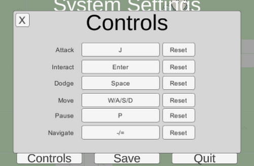
To mitigate these problems, I've built out an extensive menu system, with multiple control schemes and remapping, text size adjustment, inventory management and item detail screens, and a notification system that catches gameplay events from across the game, among other things. I still have some other features planned, like field-of-view sliders, optional motion blur, adjustments to screen effects and camera shakes, and more, to make the game more customizable and more accessible to players.
While these features are less exciting than gameplay updates, one major takeaway in this process is that they definitely cannot be overlooked!
What are your thoughts? What settings are must-haves when you play a game?
Dark Magic: An RPG Prototype
A prototype for an old school Zelda-style game
| Status | In development |
| Author | unbreaded |
| Genre | Action, Adventure |
| Tags | Pixel Art, Puzzle-Platformer, Short, Top-Down |

Leave a comment
Log in with itch.io to leave a comment.